


Core Design Principles for Custom Coffee Cups and Sleeves
Simplicity and Visual Hierarchy: Maximizing Impact in Under Two Seconds
With just two seconds to capture attention on crowded café counters, custom coffee cups and sleeves must prioritize clarity over complexity. Research confirms customers process visual hierarchy faster than text—so place your logo in the upper third of the sleeve or cup, where eyes naturally land first. Simplify supporting elements: use a single bold icon instead of intricate illustrations, and limit secondary text (like taglines) to ≤15% of the surface area. Contrast is non-negotiable; dark sleeves demand white or metallic foil branding for 400% higher recall, per Packaging Digest studies. Apply Fitt’s Law by positioning key elements near thumb-grip zones—leveraging natural tactile interaction during use.
Color Psychology and Typography: Reinforcing Brand Personality on Disposable Surfaces
Colors shape brand perception before the first sip. Warm tones like terracotta evoke artisanal craftsmanship, while cool blues suggest reliability—ideal for multi-location chains. Match your palette to substrate: kraft paper amplifies earth tones for eco-brands; matte white cups elevate pastel sophistication. Typography requires equal precision. Condensed sans-serifs project modernity but sacrifice legibility below 8pt; script fonts convey luxury yet distort on curved surfaces. For readability, maintain:
- Minimum 12pt font size for critical text
- ≥40% luminosity contrast between text and background
- Kerning adjustments tailored to curved cup printing
Avoid font mixing—93% of top-performing foodservice brands use one typeface family across cups and sleeves (2024 Foodservice Packaging Trends). Soy-based inks ensure color fidelity while reinforcing sustainability narratives, unlike UV alternatives that require plastic-coated substrates.
Creating a Cohesive Disposable Ecosystem with Custom Coffee Cups and Sleeves
Aligning Sleeves, Cups, Napkins, and Bags Under One Visual Identity System
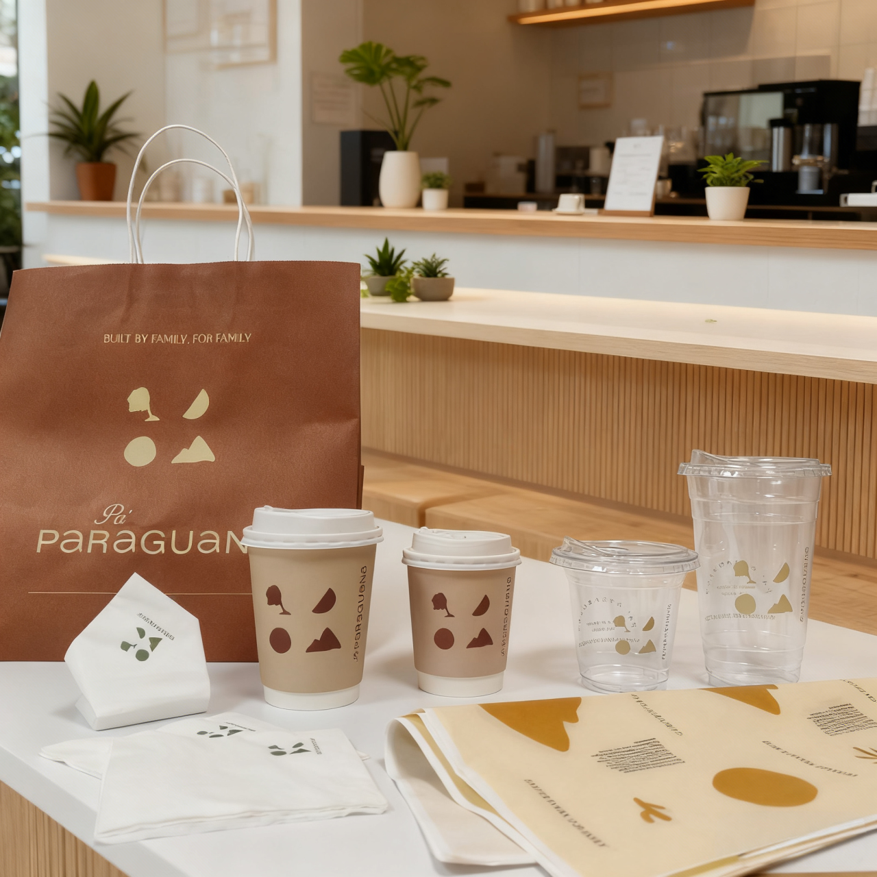
A unified visual system across disposable items strengthens brand recall exponentially. Use identical color palettes, typography, and logo placement on sleeves, cups, napkins, and bags. This repetition trains customer recognition—consistent branding increases revenue by 23% (Lucidpress, 2020). Restrict primary colors to two or three hues for clarity. Ensure fonts remain legible when scaled down for smaller surfaces like napkin edges. Position logos consistently—top-center for cups and side panels for sleeves. Every touchpoint becomes a reinforcing brand moment, with custom coffee cups and sleeves acting as anchors in this ecosystem.
Case Study: Blue Bottle’s Monochrome Minimalism Across Cup and Sleeve Formats
Blue Bottle Coffee demonstrates the power of disciplined cohesion. Their approach uses only black-and-white graphics across cup sleeves and vessels—clean lines, generous negative space, and a single accent color create immediate identification. Minimalist typography—a crisp sans-serif font—appears identically on both surfaces. This restraint conveys premiumness while reducing production complexity. The harmony between cup and sleeve transforms disposables into signature brand assets. Recognition rates surged 40% post-implementation (Design Audit, 2023), proving visual consistency directly impacts market differentiation.
Strategic Placement and Messaging on Custom Coffee Sleeves
Leveraging High-Dwell-Time Sleeve Real Estate: F-Pattern Scanning and Zone Mapping
Custom coffee sleeves offer 5–8 minutes of uninterrupted brand exposure—longer than most digital ads. Capitalize on this high-dwell-time surface using F-pattern scanning principles: place your logo in the top-left corner (where 67% of visual attention lands) and position calls-to-action along the left vertical axis. Zone mapping further optimizes impact:
- Prime Zone (Top ⅓): Reserve for primary brand elements
- Engagement Zone (Middle): Feature QR codes or short social handles
- Sustainability Zone (Bottom): Display eco-certifications
Placement trumps density—a Stanford Eye-Tracking Study (2024) found simpler designs with strategic positioning increased brand recall by 89% versus cluttered layouts. Remember: coffee sleeves carry your brand into offices, streets, and social feeds. Treat every millimeter as premium real estate.
Material, Print, and Sustainability Choices That Shape Brand Perception
Kraft vs. Glossy, Soy Ink vs. UV Printing: Communicating Premiumness or Eco-Values
Selecting materials for custom coffee cups and sleeves directly signals brand values to environmentally conscious consumers. Rough-textured kraft paper immediately communicates eco-commitment, while high-gloss finishes suggest luxury. Similarly, soy-based vegetable inks—biodegradable and low-VOC—reinforce sustainability narratives, contrasting with UV-cured printing that delivers sharper graphics but requires energy-intensive processes. Research reveals 76% of consumers associate specific finishes with brand ethics, with matte recycled materials subconsciously building trust. As studies indicate, 68% of patrons pay premium prices for products aligning with personal values. Integrating soy ink on kraft sleeves often strengthens loyalty more effectively than glossy UV alternatives. Consider these perception drivers:
| Material Attribute | Premium Perception Signal | Eco-Value Signal |
|---|---|---|
| Surface Finish | High-gloss coating | Uncoated kraft texture |
| Ink System | UV-cured vibrancy | Soy-based opacity |
| Visual Cue | Metallic accents | Natural fiber visibility |
FAQ
Q: Why is simplicity important for coffee cup design?
A: Simplicity ensures that key branding elements, such as logos and taglines, are easily noticed and remembered within seconds by customers in busy café environments.
Q: What colors should I choose for my coffee cups?
A: Choose colors that align with your brand identity. Warm tones like terracotta suggest craftsmanship, while cool blues imply reliability. Match colors with the substrate for maximum impact.
Q: Why is consistent visual identity across disposables important?
A: Consistent branding across items like cups, sleeves, napkins, and bags increases brand recall and strengthens customer recognition, which can lead to increased revenue.
Q: What materials are best for eco-conscious branding?
A: Kraft paper with soy-based inks conveys eco-values effectively. These materials are biodegradable, low in VOCs, and resonate with environmentally mindful consumers.
Q: How should I optimize a coffee sleeve for brand messaging?
A: Use strategic placement zones like the top-left corner for logos, the middle for engagement elements like QR codes, and the bottom for sustainability certifications to maximize recall and branding.